Jeopardy! fonts - for font nerds

This is where all of the games are discussed.

Moderators: alietr, trainman, econgator, dhkendall

Post Reply
User avatar
Robert K S
Jeopardy! Champion
Posts: 5313
Joined: Thu Jun 30, 2011 1:26 pm
Location: Cleveland, Ohio
Contact:

Jeopardy! fonts - for font nerds

Post by Robert K S »

Came across this interesting article reviewing the fonts used on the show, with some images. The page doesn't say what font is used when the text of a clue is occasionally superimposed over a celebrity video read.

I noted the article's dig at "lack of proper [i.e., curly] quotes and apostrophes" and wondered what the date was that the show switched to straight quotes (they used to be curly back in the '80s and maybe some of the '90s).

Also there seemed to be some curiosity in the article as to why Korinna would be picked given that there are more legible fonts. Well, there might not have been much choice at the time Korinna was picked. According to an August 23, 2014 blog post by Tom Thomas, which I will reproduce below for posterity because I can't find a way to link to it and am not able to access it except through a Google cache which will probably be wiped sooner or later, the font was likely one of the few available for the Chyron that would have been able to be made big enough to read on a 13" clue screen at a distance across a soundstage. I also recall it being one of the most popular fonts on TV during the '80s, being used for sitcoms, morning shows, and loads of game shows.

I can understand keeping Korinna around on the clue screens to this day, despite the plethora of more readable choices available--tradition, you don't fix what ain't broken, etc. What I can't understand is why the show uses the font in print on the game boards Alex uses at his lectern, and on the prompt cards used by the Clue Crew when recording video clues.
AUGUST 23, 2014 I'LL TAKE SPORTS FOR $200, ALEX
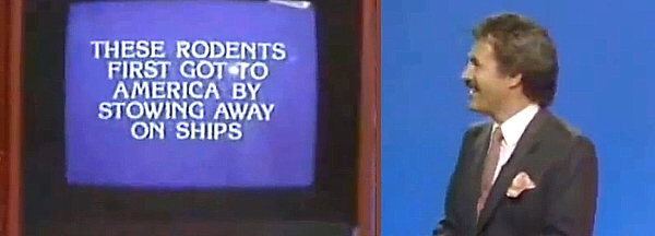
Image

(Lights flash)

Tom: “What is Korinna?”

Alex: “That is correct!”

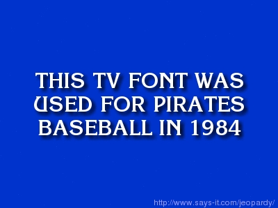
Early in 1984, Betsy Overly and I were planning the graphics for Pittsburgh Pirates cablecasts. We needed a fresh look and a new font style.

Chyron, the company that manufactured the character generator, provided a “font library” for their machine on 8-inch floppy disks. A few dozen styles were available. Some were offered in only one size, but there were several that came in five different sizes, providing flexibility.

One of those, called Korinna Bold, caught our eye. It was a fresh, relatively new font; the modern version had been introduced only ten years before. It had some flair, with the distinctive shapes of the P and the N and especially the U, yet it was sufficiently bold for sports television. So we chose it to build the full screens and lower thirds that we’d need for baseball. Our new look premiered on a road game on April 6.

Unfortunately, by the time the team returned to Pittsburgh, the network was out of business, and our graphics package was never seen again. More details are here.

That same year, however, a long-running game show was being updated with a new host and a new look for syndication. And the producers made the same Chyron choice that Betsy and I had made.

Thirty years ago next month, Alex Trebek introduced Jeopardy! with the clues given in Korinna. The font’s still there three decades later. You can’t keep a good idea down.

Image

Here are some other notes.

• Korinna was also used for the intertitles and closing credits on the 1993-2004 comedy Frasier.

• Ken Jennings claims that when he had his winning run 10 years ago, the name of the show was still pronounced “jee-OP-ur-dee.”

• And why is it called Jeopardy anyway? Alex could say, “I told you that on the very first program, when I explained how the game is played. Weren’t you listening? Do I have to repeat the rules every 30 years?”
And for those interested in the original Corinna...
User avatar
Dr. J
Decade Battler and Mustache Maker
Posts: 566
Joined: Fri Sep 28, 2012 1:35 pm

Re: Jeopardy! fonts - for font nerds

Post by Dr. J »

As a self-described font nerd, I appreciated this article on a number of levels. Thanks for sharing! I'm still shaking my head at the redesigned Daily Double graphic -- not particularly legible, and with really retrograde (and not in a good way) colors and font choice. Almost as bad as Comic Sans...
User avatar
Magna
Hooked on Jeopardy
Posts: 3079
Joined: Thu Jan 19, 2012 2:37 pm

Re: Jeopardy! fonts - for font nerds

Post by Magna »

Just a hunch, but I'm guessing the Korinna clue was offered, in part, as an indirect reference to one of their contestant coordinators.
User avatar
MarkBarrett
Watches Jeopardy! Way Too Much
Posts: 16556
Joined: Fri Jul 01, 2011 10:37 am
Location: San Francisco

Re: Jeopardy! fonts - for font nerds

Post by MarkBarrett »

Robert K S wrote:Came across this interesting article reviewing the fonts used on the show, with some images. The page doesn't say what font is used when the text of a clue is occasionally superimposed over a celebrity video read.
The "Font Whisperer" or "Deep Font" sent me a message with a guess of Optima Bold: https://www.myfonts.com/fonts/linotype/optima/pro-bold/
User avatar
dhkendall
Pursuing the Dream
Posts: 8789
Joined: Fri Jul 01, 2011 11:49 am
Location: Winnipeg, Manitoba
Contact:

Re: Jeopardy! fonts - for font nerds

Post by dhkendall »

Robert K S wrote:What I can't understand is why the show uses the font in print on the game boards Alex uses at his lectern, and on the prompt cards used by the Clue Crew when recording video clues.
Corporate branding, really. (That's my guess anyways). Even though no one else sees it, it's there for the sake of consistency. I'm sure they'd do their website in all caps in Korinna too if they could. :)
"Jeopardy! is two parts luck and one part luck" - Me

"The way to win on Jeopardy is to be a rabidly curious, information-omnivorous person your entire life." - Ken Jennings

Follow my progress game by game since 2012
bpmod
Rank
Posts: 5424
Joined: Fri Jul 01, 2011 12:26 pm
Location: Hamilton Ontario

Re: Jeopardy! fonts - for font nerds

Post by bpmod »

dhkendall wrote: I'm sure they'd do their website in all caps in Korinna too if they could. :)
Wait! They have a website?!

Brian
...but the senator, while insisting he was not intoxicated, could not explain his nudity.

If I had 50 cents for every math question I got right, I'd have $6.30 by now.
User avatar
trainman
Moderator Extraordinaire
Posts: 1604
Joined: Fri Jul 01, 2011 10:27 pm

Re: Jeopardy! fonts - for font nerds

Post by trainman »

Korinna (in mixed case) was the headline font of the newspaper I grew up reading, the Tampa Tribune, from 1983 to 1990.
User avatar
Robert K S
Jeopardy! Champion
Posts: 5313
Joined: Thu Jun 30, 2011 1:26 pm
Location: Cleveland, Ohio
Contact:

Re: Jeopardy! fonts - for font nerds

Post by Robert K S »

Jeoparody font spotted in the wild! And in a pretty awesome place, I might add. (Is there any way to adjust the display size on these uploads?)
Attachments
Front of the box
Front of the box
20150905_080430.jpg (2.58 MiB) Viewed 6898 times
Back of the box
Back of the box
20150905_080410.jpg (2.91 MiB) Viewed 6898 times
bpmod
Rank
Posts: 5424
Joined: Fri Jul 01, 2011 12:26 pm
Location: Hamilton Ontario

Re: Jeopardy! fonts - for font nerds

Post by bpmod »

Robert K S wrote:(Is there any way to adjust the display size on these uploads?)
I would download it, adjust it, and upload the result. But that's just me.

Brian
...but the senator, while insisting he was not intoxicated, could not explain his nudity.

If I had 50 cents for every math question I got right, I'd have $6.30 by now.
Post Reply